Below, you will find some examples of plots and scripts that are relevant for some of your projects.
There is also an own section on ggplot in bioSTATS, and at the ggplot web-page.
Example 1:
Polar cod contribution to fish community
For the plots below you will need the following packages.
[code language="r"]
library(ggplot2)
library(RColorBrewer)
library(scales)[/code]To be able to see how the code works, first create a dummy data sheet:
[code language="r"]
#creating example dataframe (df): fist create vectors, then combine them
year < c(rep("2015", 8), rep("2016", 8), rep("2017", 8), rep("2018", 8)) #rep() creates repetitions (see ?rep for more info)
station <- rep(c(rep("Isfj",2), rep("Kongsfj",2), rep("Hinlopen",2), rep("MIZ",2)),4) # rep() can also be used on a vector; the whole vector is repeated
gear <- rep(c("Pelagic","Benthic"),16)
polar.cod <- c(rnorm(16, mean=30, sd=5),rnorm(16,mean=40,sd=5)) #rnorm() creates values with a normal distribution; you define number of observations, mean and standard deviation
other <- c(rnorm(16,mean=55, sd=5),rnorm(16,mean=35,sd=5))
df <- data.frame(year, station, gear, polar.cod, other) #data.frame() creates a data frame out of vectors
df #have a look at the example data
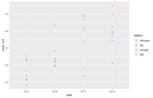
[/code]Now we can plot. We start with a simple scatter plot, showing abundace data for polar cod in different years. Samples from different stations have different colours.
ggplot() begins the plot. Here you can e.g. define the data that will be used for the plot. On this, first empty plot, we add layers, which actually plot our data.[code language="r"]
p <-ggplot(df, aes(year, polar.cod, color = station)) # ggplot() begins the plot; here i have defined the data to be used and that dots are will be colour-coded
p + stat_identity() #stat_identity() is the added layer. It plots the polar cod abundances for each observation, sorted according to years.
[/code]
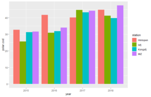
Now we will have a look at how to plot different bar plots. We start simple with bar plots for only polar cod abundances.
[code language="r"]
# using geom_col() or geom_bar()
p <-ggplot(df, aes(year, polar.cod, fill = station)) #start the plot and save it in an object (not needed, but makes following coding simpler)
p + geom_col(position=position_dodge(width=0.90)) # in geom_col() the heights of the bars represent values in the data
p + geom_bar(stat = "identity",position="dodge") #gives same plot as above. By default, in geom_bar() the height of the bar is proportional to the number of cases in each group. With the use of stat="identity", the values are represente.
#Through position="dodge, we define that the bars from the same year appear beside each other
[/code]
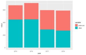
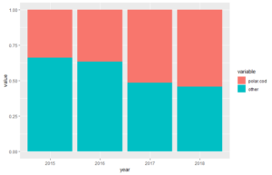
Now, we want to show not only the cod abundance (or biomass, depending on what you choose as input data), but also the abundances of the total of other fish species in the trawls. For that, we first need to change our data sheet from a wide format to a long format. A long format is often better for variables comparison.
[code language="r"]
# We use melt() from library(reshape) to create a long table format
df.long <- melt(df,id.vars =c("year","station","gear")) #under id.vars= you define which columns to keep in columns
df.long
[/code]Now we can create our plot, using the new data frame.
[code language="r"]
#we use geom_bar for both plot variation.
p <-ggplot(df.long, aes(year, value, fill = variable))
p + geom_bar(stat="identity",position="stack") #we use position="stacked" to create stacked bars
p + geom_bar(stat="identity",position ="fill") #we use position="fill" for stacked bars with normalized hight
[/code]
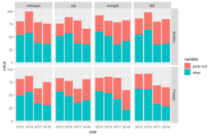
Now, we want to show more variables in our plot. We can do this by sorting several plots with subsets of data in a grid layout. We do this with the function facet_grid().
[code language="r"]
#combination of stacked plots; polar cod vs other species, sorted according to gear, year and location
d <- with(df.long, df.long[order(year, variable, station),]) #we need to sort the data correctly first
ggplot(data=d, aes(x=station, y=value, fill=variable)) + #define the data to use: X, Y, Z (through fill=)
geom_bar(stat="identity") + # add layer of bars
facet_grid(~year) # subdevide plot into years
[/code][code language="r"]
#and even more sub-devisions
d <- with(df.long, df.long[order(station, variable, year),])
ggplot(data=d, aes(x=year, y=value, fill=variable)) +
geom_bar(stat="identity") +
facet_grid(gear~station) #subdevides plots (and data) both according to station and gear (pelagic or benthic)
[/code]
Example 2:
Fish legth distribution comparison
Again, we first prepare our example datasheet for demonstration:
[code language="r"]
#exampe data
year <- c(rep("2014",3),rep("2015",3),rep("2016",3),rep("2017",3),rep("2018",3),rep("2015",3))
station <- rep(c("K","I","s"),6)
fish1 <- c(rnorm(17, mean=25, sd=5),NA)
fish2 <- c(rnorm(17, mean=23, sd=5),NA)
fish3 <- c(rnorm(17, mean=20, sd=5),NA)
fish4 <- c(NA,rnorm(17, mean=22, sd=5))
fish5 <- c(NA,rnorm(17, mean=21, sd=5))
df <- data.frame(year, station,fish1,fish2,fish3,fish4,fish5)
[/code]And, also like in the example above, we need to reshape our data into a long table format:
[code language="r"]
#again, we need to reshape the data into a long format
dfl <- melt(df, id=c("year","station"))
#if you have a lot of NA, you should remove them
dfl <-na.omit(dfl)
[/code]
Now we can start preparing plots (for more explanation on ggplot set-up see above).
[code language="r"]
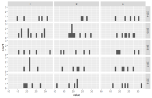
# a bar plot with the number of fishes measured at each station (to inspect data)
ggplot(dfl, aes(year)) +
geom_bar() +
facet_grid(~station)
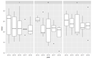
[/code]Noe we start with what is really important for us. Below, there are 3 examples of plots that might be useful.
[code language="r"]
#now showing length plots
# histograms - here in grid of years and stations
ggplot(dfl, aes(value)) +
geom_histogram() +
facet_grid(year~station)# boxplots - also in grid
ggplot(dfl, aes(year, value)) +
geom_boxplot() +
facet_grid(~station)# violin plot - also in grid
ggplot(dfl, aes(year, value)) +
geom_violin() +
facet_grid(~station)
[/code]
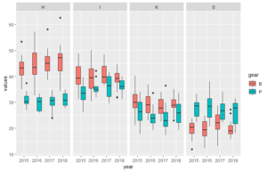
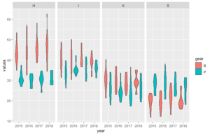
Below the code for a dataset that better illustrate how the plots can look like (plot 3 and 4 above).
[code language="r"]
#dataframe (example)
year <- rep(c("2015","2015","2016","2016","2017","2017","2018","2018"), 50)
station <- c(rep("K", 100), rep("I", 100), rep("S", 100), rep("H", 100))
gear <- rep(c(rep("P",50),rep("B",50)),4)
values <- c(rnorm(50, mean=25, sd=5), rnorm(50, mean=30, sd=4), rnorm(50, mean=35, 3), rnorm(50, mean=40, sd=5),rnorm(50, mean=28, sd=5), rnorm(50, mean=20, sd=4), rnorm(50, mean=31, 3), rnorm(50, mean=45, sd=5))
df <- data.frame(year, station, gear, values)#plot of length of fish in each trawl
# with boxplots
ggplot(df, aes(year, values, fill=gear)) +
geom_boxplot() + #boxplot of values from measuremtns in different years
facet_grid(~station)
# with violin plot
ggplot(df, aes(year, values, fill=gear)) +
geom_violin() +
facet_grid(~station)
[/code]Fant du det du lette etter? Did you find this helpful?[Average: 0]