
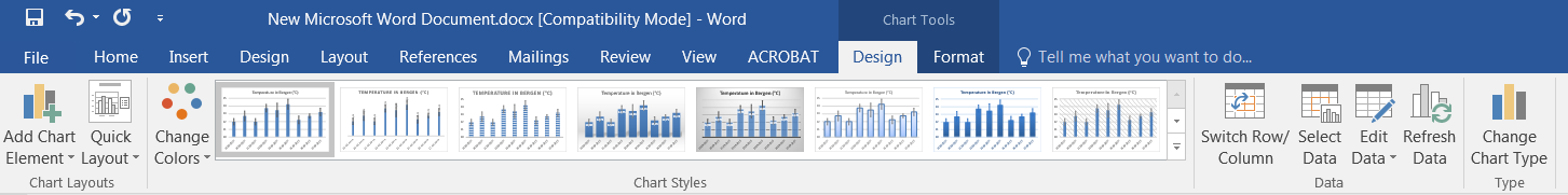
 Right-click on the chart area to display the contextual menu and select
 Copy. Alternatively, if the chart is already selected, use the shortcut CTRL+C to copy the object to the clipboard. Go to MS Word or MS Powerpoint, right-click anywhere on the blank page/slide (or any open document) and select one of the Paste Options (see picture to the right). Depending on which option you choose here, you will import a snapshot of the chart, an “embedded” object with the possibility to change the appearance of the chart directly in MS Word (without having to use MS Excel), a “linked” object with the possibility to update the chart whenever the original data in the MS Excel file is modified…Use Destination Theme & Embed Workbook) gives you the possibility to import the chart and to later modify its appearance directly in MS Word or Powerpoint. What you need to remember is that the data series contained in the imported chart are embedded at the moment of the transfer. This means that you may change titles, colors, fonts as well as the size and position of any of the elements contained in the chart area at all times, without the need for the original worksheet to be active in MS Excel. You may even choose to change chart type (for instance from bar chart to line chart) without opening MS Excel. Most of the options are accessible via a right-click on the chart area or the plot area. The contextual menu that you get is globally equivalent to the one that you would have had access to in MS Excel. Also, once the chart is pasted in MS Word and selected, the Chart Tools options with the tabs Designand Format and their respective ribbons become available in the MS Word menu bar.Edit Data... (see below).Clicking on Edit Data... opens the original worksheet and allows you to modify the data series. Any modification applied to the data series at that moment will not only change the chart that is currently in the Excel worksheet, but also the imported chart in MS Word.
2. The “linked” chart:
![]() The third icon (
The third icon (Use Destination Theme & Link Data) gives the possibility to import a chart which is dynamically linked to the original worksheet in MS Excel. Just like for the “embedded” case, the elements of the chart are modifiable at all times. The big difference is that modifications to data series in MS Excel that occur AFTER the transfer with copy/paste will change the content of the chart in both MS Excel and MS Word (or Powerpoint). It might therefore be a bit dangerous to use that option if you still need to work on the original dataset. Making a mistake in MS Excel will also result in a mistake in MS word, and it might be hard to keep control on everything… Note that there is, in MS Word, a button called Refresh Data in the section Data of the Design tab of the Chart Tools (see below). Use it if you want to synchronize your data between MS Excel and MS Word.
3. The snapshot:
![]() This fifth icon
This fifth icon Picture pastes a snapshot of your MS Excel chart. Clicking on this icon converts whatever you have selected in MS Excel into a flat picture. There is no data embedded in the picture, nor can you modify the elements of the chart. This option is certainly the safest option if you are afraid to make mistakes once the chart has been imported. On the other hand, this option is less practical if you wish to tune your chart (change size, titles and colors) after importing it.
4. Other options:
The second and fourth icons give roughly the same results as the first and third icons, respectively. There is “just” a difference in the theme that the “import/export” function will apply to your chart when pasting it. While the icons described above make use of the destination theme (the one in MS Word) to adapt the chart to the local environment, the two other icons keep intact the source formatting (the one in Excel).
5. So which one should I use?