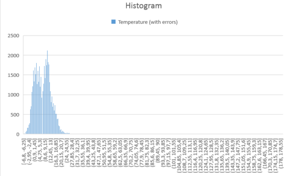
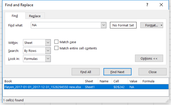
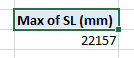
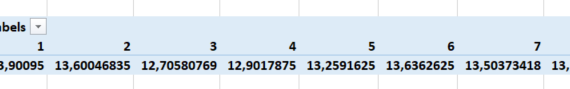
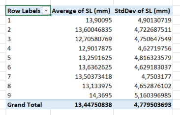
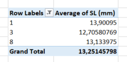
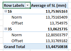
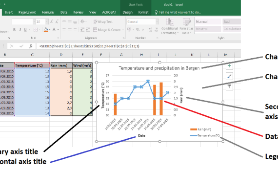
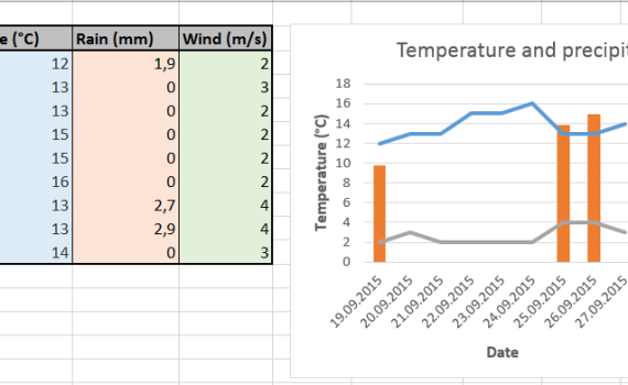
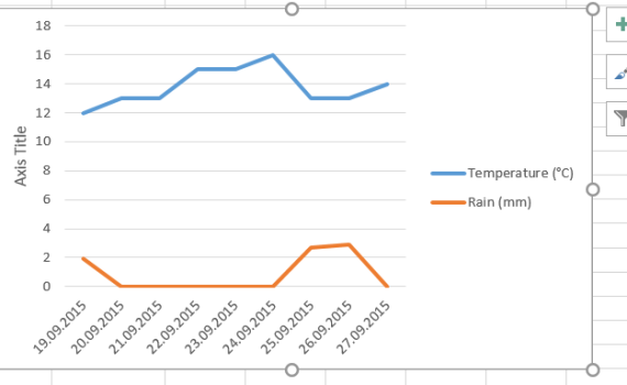
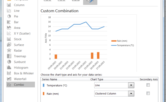
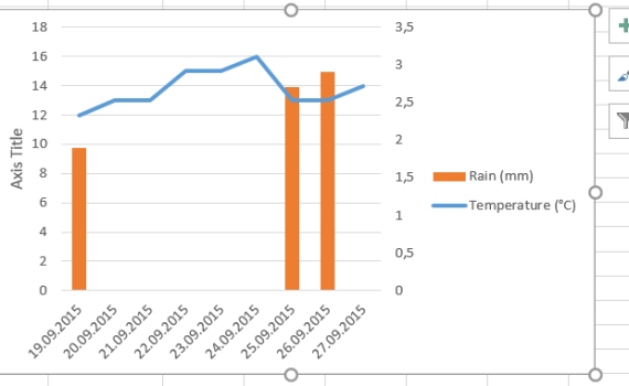
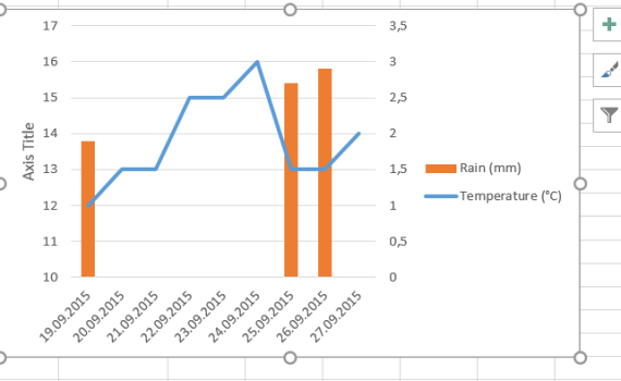
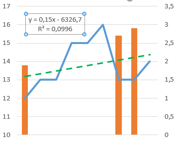
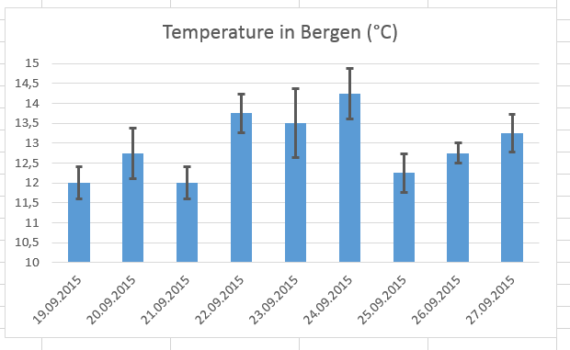
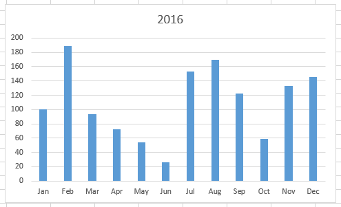
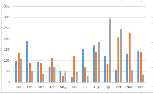
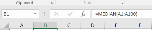
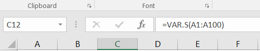
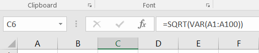
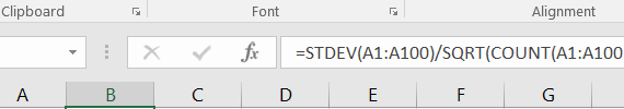
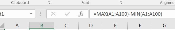
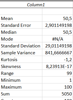
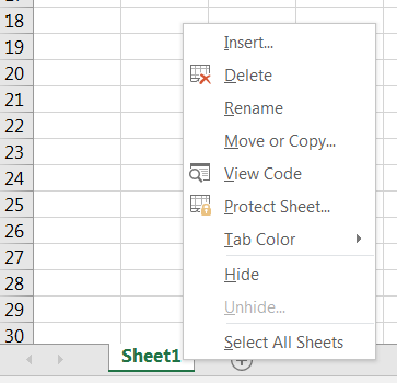
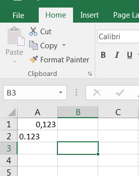
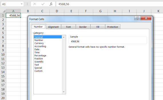
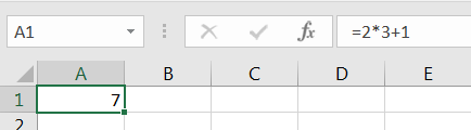
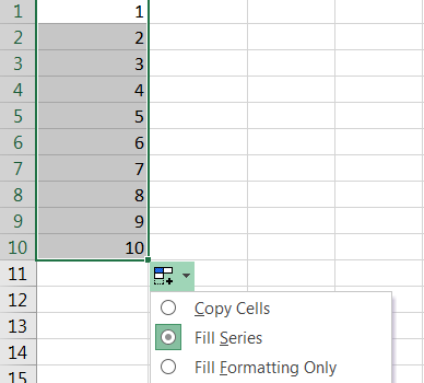
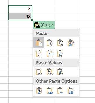
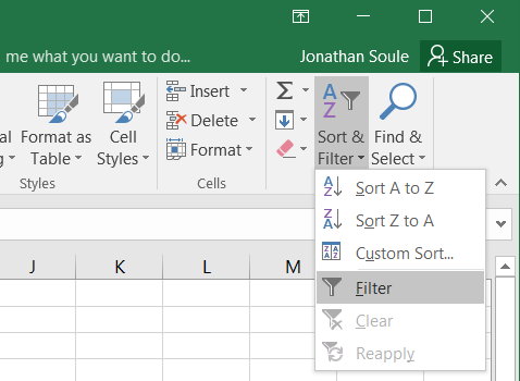
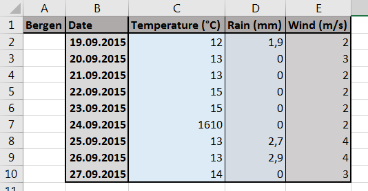
MS Excel 2016 (EN)

Microsoft Excel (MS Excel) is one of the most popular spreadsheet applications and has become for many the “default” software to handle data, numbers, graphs and analysis. Other spreadsheet applications such as Calc (Open Office/Libre Office) are certainly as good as (or even better than) MS Excel. bioST@TS makes the choice to focus first on MS Excel 2016 since it is available to all employees at the University of Bergen and is free for students at UiB via Office365.


A pivot table is a table that displays statistics generated from a larger table that contains your “raw” data set. This pivot table may display counts, sums, averages and other statistics describing variability. It thus allows you to get an overview over thousands of data points within a few clicks. […]

1. What is a pivot table


It is not so often that one gets to use a pie chart… and it is not so often that such a chart is used for the right purpose. Pie charts can be used to represent different categories of a population, polls, data referring on proportions and percentage. Let’s learn how to make […]

11. Make a pie chart


You may realize, looking at the pie chart that we just made previously, that the design of the chart area is rather inadequate. The chart itself is ridiculously small compared to the legend. This is essentially due to a default setting that MS Excel uses and which restricts the size/position of the […]

12. Resize the legend box


To calculate the variance of a series, you may choose between using the =VAR.P(...) and =VAR.S(...) functions. Both functions provide the variance, but based on different assumptions and therefore on slightly different formulas. Use =VAR.P(...) if the dataset that you analyse is a whole population.     Use =VAR.S(...) if […]

3. Calculate the variance


Often, the simplest way to visualize your dataset or sample will be through a histogram, also called frequency histogram. The histogram will eventually represent the distribution of the data and the shape of the chart will most certainly give you information on whether this distribution is symetrical, bimodal, skewed… To […]

8. How to draw a histogram


A boxplot (box plot, or whisker plot) is a compact, but efficient way to represent a dataset using descriptive stats. This “little diagram” combines informative, standard values such as the first and third quartiles (the bottom and top of the box, respectively), the median (the flat line inside the box) […]

9. How to draw a boxplot


When first starting MS Excel 2016, the program opens an empty workbook file named by default “Book1” (as indicated in the title bar on the top of the window). This workbook contains a single empty worksheet called “Sheet1” represented by the a tab at the bottom of the window. In its most common […]

1. Starting up MS Excel 2016


  Default workbooks always come with a single empty worksheet. At any time, you may add a new worksheet to your workbook just by clicking on the icon + next to the tab for the current workbook. The new sheet automatically appears to the right of the last one. Note that the combination Shift+F11 […]

2. Opening a new worksheet


  You do not necessarily need to suffer from obsessive compulsive disorder (OCD) to organize and tidy a bit your data. It is actually a good practice to sort tables using parameters and variables. MS Excel has a useful tool that performs this type of tidying according to one or several variables […]

11. Sorting your data