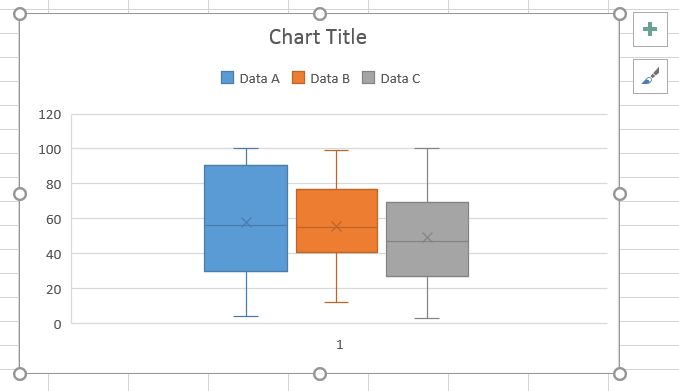
Multiple boxplots are quite useful charts when it comes to visualize several groups or categories, their median and variability, all at once.
To draw the multiple boxplot, select the table with your data organized in columns (you may select as well the headers), then go to the tab Insert, find the icon Insert Statistic Chart and select Box & Whisker. The following chart appears. Using the + button to the right of the chart, add the legend and a title to the chart, if you wish so.
Fant du det du lette etter? Did you find this helpful?
[Average: 0]
