
A scatter plot (also called scatterplot or XY plot) is a chart that displays all single data points or entries in your dataset in the form of single dots. These data points must be described in the form of a pair of numbers, one being the independent variable (X) and the other one being the dependent variable (Y). The independent variable may be continuous or categorical. A typical example could be a graph showing the weight and height of a group of individuals.
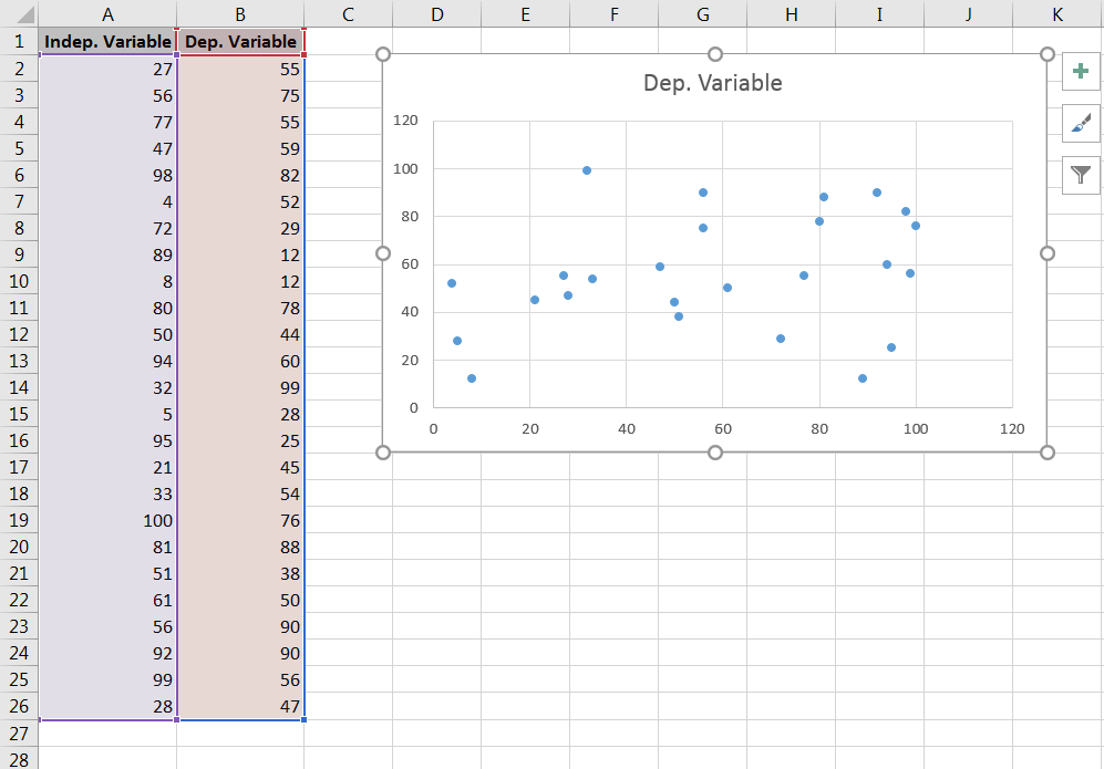 Starting from a two-column table, select both columns with their header and then go to the tab
 Insert, find and click the icon Scatter. The following chart appears.
 Using the
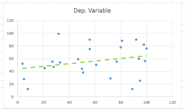
 + button to the right of the chart, add a trendline and adjust the look of the chart as you wish.
Fant du det du lette etter? Did you find this helpful?
[Average: 2]