
Bar graphs (also called bar charts or column charts) are one of the most common type of chart along with line charts. Bar graphs are useful to rapidly visualize differences between values, groups or categories based on the relative height of rectangular bars or boxes. These bars can be either vertical or horizontal, single/isolated or grouped/clustered.
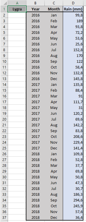 As usual, it is best to start with a well-organized table that contains the data set. Here, we take an example where precipitations at Lygra (Hordaland) were measured during the past years. The table shows data for each month in 2016, 2017 and 2018.
 Let's start simple and create a graph that displays the precipitations for the 12 months of 2016. In the
 Charts section of the Insert ribbon, click the icon Insert Column or Bar Chart and choose the type of chart you would like to use (here we use the one at the top left corner of the menu Clustered Column).
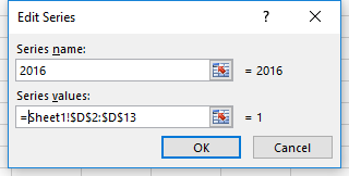 A blank chart appears. Right-click in it and click
 Select Data.... In the new dialog box called Select Data Source, click Add under Legend Entries (Series). The next box helps you define your data series. Under Series name, type in "2016", for example. Under Series values, select the range of data to display (D2:D13). Finish by clicking OK.
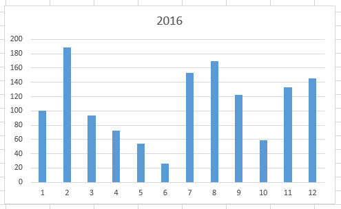 This chart now appears. The 12 values are displayed in the right order, and the Y-axis has been set from 0 to 200 to display optimally the data. The name of the series (2016) appears as the main title. However, the name/label under each bar is just a number from 1 to 12.
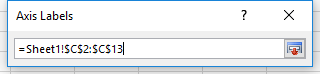 To set the month under each bar, we go back to the dialog box
 Select Data Sourceand click on Edit under Horizontal (Category) Axis Labels. The new dialog box allows to set the range of cells that contains the labels. Here we use C2:C13 and click OK.
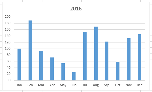 The graph gets updated and now shows the month under each bar.