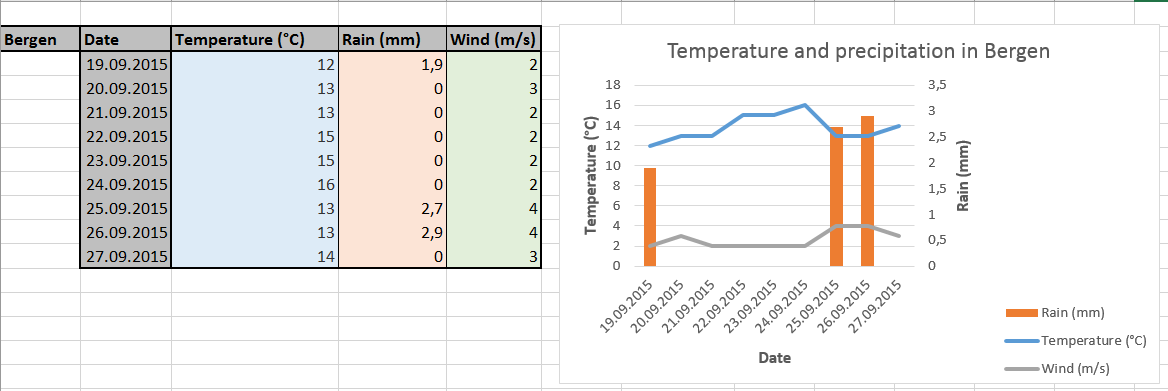
As you will soon discover, the tools that MS Excel 2016 offers in order to let you build a chart work best when your data are “packed” in tables, rows and columns. Anyway, it is always good practice to organize your dataset so that data which depend on common variables (such as date, labels, names, sample number or ID) are aligned. Look at the example in the picture below. The table to the left contains data for temperature, rain and wind in Bergen over a period of 9 days. Beside the fact that summertime was obviously behind us at this time, you notice that these values all appear next to the corresponding date. This allows to make a single graph (to the right) representing all 3 parameters in three distinct data series (two lines and a bar graph) while everything refer to the same value on the horizontal (X) axis.

