
It is often recommended to start looking at a dataset with a plot, prior to any statistical analysis. A plot can reveal a lot: trend, variability, clusters, subpopulations, distribution. It can also reveal mistakes in the dataset, such as aberrant values.
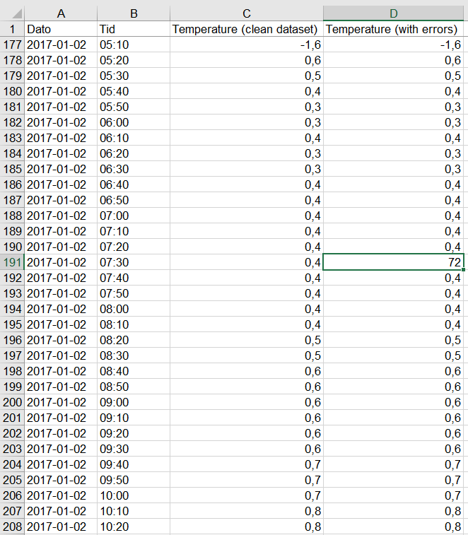 Here is an example where local temperatures have been retrieved from a weather station at Fløyen, in Bergen for the period 1/1/2017-31/12/2017 and placed in an Excel sheet. Since temperatures are retrieved from the station every 10 minutes, there are over 52000 values in total! It is virtually impossible to “manually” check that each and every data point in the table is correct or make sense. We thus need to find a way to spot the mistake more rapidly. Note: the column C contains the data that was retrieved; the column D contains the same data, but 5 aberrant data points (temperature between 70 and 200 degrees Celsius, see highlighted cell) have been inserted for the purpose of this example.
Using a line chart
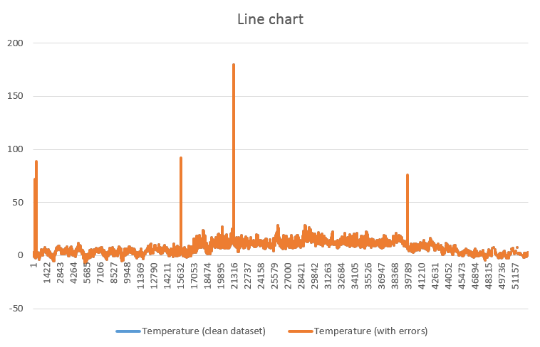
A quick way to check for higher- or lower values than “normal” is to create a line chart. Check here how to create a line chart.
You can see at once that most of the data is found in the “expected” range (somewhere between -5 and +30 degrees), but that 4 or 5 high values show up immediately in the form of local, thin peaks. With a bit of reasoning, you can easily attribute these peaks to faulty measurements, rather than proper data points. You may now find them in the Excel sheet based on the approximate date and correct/erase them.
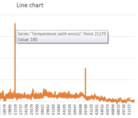 Note that placing the mouse pointer precisely on these peaks brings up a text box with the faulty value, as shown here. Using
 CTRL + F, you may search for “180” in the dataset and correct that value.
Using a boxplot
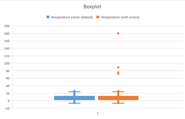 A box plot is an efficient way to reveal the variability of a dataset as well as outliers (if any). Note that not all aberrant points qualify as outliers… Here is the way to create a multiple boxplot. While the blue boxplot shows a dataset with (apparently) no outlier, the orange boxplot shows the presence of (at least) 4 outliers with values larger than 60. Again, use the mouse pointer on the chart to find these large values and correct/erase them manually.
Using a histogram
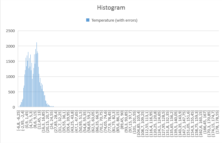 A histogram is also a way to visualize the distribution of your data. Here is how to create one. The resulting plot shows the distribution of the temperatures, but strangely “all” the data is squeezed to the left, suggesting that there exists a small number of values that are much larger than the rest. The resolution of this plot is however not good enough to spot these values.