
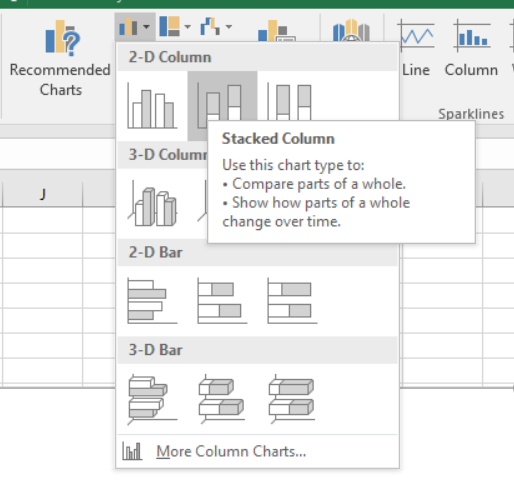
 We start in the same manner as we did previously for the graph with single or clustered data series. In the
 Charts section of the Insert ribbon, click the icon Insert Column or Bar Chart and this time choose Stacked Column.
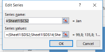 A blank chart appears. Right-click in it and click
 Select Data.... In the new dialog box called Select Data Source, click Add under Legend Entries (Series). The next box helps you define your data series. Here, we will have to create as many series as there are categories to stack up, so 12 series for 12 months. Each series will contain the amount of precipitations for each year. Thus, type in "Jan" under Series nameand under Series values, select the range of data to display (D2;D14;D26). Finish by clicking OK.
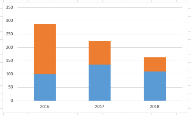
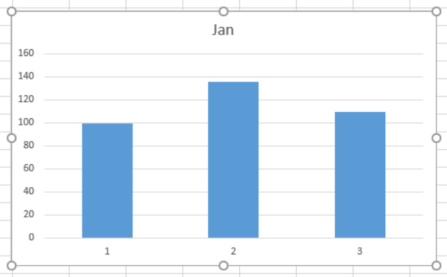 The graph now shows three boxes corresponding to January 2016, January 2017 and January 2018.
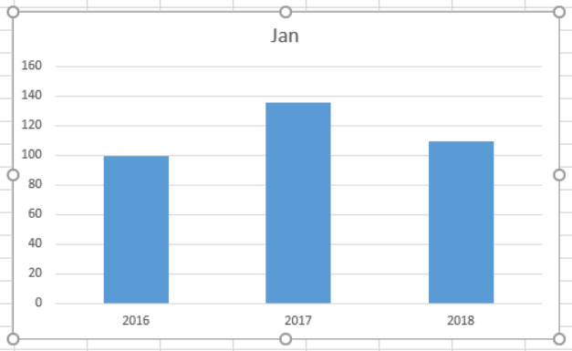 To set the year as a label under each bar, we go back to the dialog box
 Select Data Sourceand click on Edit under Horizontal (Category) Axis Labels. The new dialog box allows to set the range of cells that contains the labels. Here we use B2;B14;B26 and click OK. Now the X-axis is properly labeled.
 We'll keep adding the series corresponding to the monthly precipitations. Back to the box
 Select Data Source, click Add under Legend Entries (Series). Type in "Feb" under Series nameand under Series values, select the range of data to display (D3;D15;D27). Finish by clicking OK. The chart updates itself and now shows the "Feb" series on top of the "Jan" series. Keep entering the 10 remaining series in the same manner.
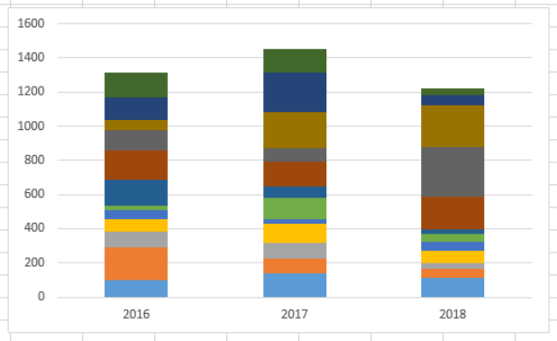 Once all the series are entered, the resulting graph looks like this. At this point, one can easily visualize the total amount of precipitations for each of the three years (represented by the height of the bar), and the monthly precipitations (represented by the colorful boxes). But it is also quite confusing due to the complexity and amount of colors... Adding a legend to the chart often becomes necessary for this type of chart.
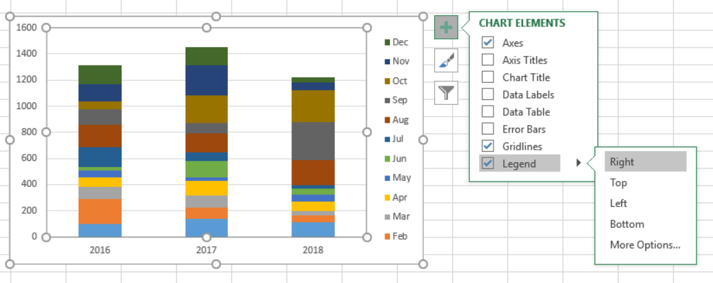 To add a legend, press on
 +. In the menu, tick off Legend, and, using the arrowhead to the right, define its position in the chart.