
Since it is your first chart, we’ll take it easy and use a single dataset. Let’s use the previous example, concentrating on temperatures in Bergen between Sept. 19th and Sept. 27th 2015.
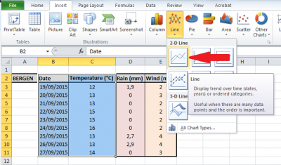 The “easy way” consists in selecting the data which has to be contained in the graph: this means that we need to select both the temperatures and the dates. Using the mouse, select the area B2:C11. Then “tell” MS Excel to use that selection to make a line graph: in the section
 Charts of the ribbon under the Insert tab, click on the arrow under Line to get the full menu. Click on the first icon (the simplest line chart type) and check that the result matches your expectations.
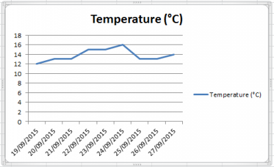 The “easy way” described above is straight forward and gives you the following graph (picture to the right) in a couple of clicks, but it doesn’t really show you how things are done. If you don’t care much about the mechanisms behind the making of graphs in MS Excel and just want to get an average graph within seconds, keep on with the easy way. If you’d like to get more control over MS Excel and learn how to get things done the way YOU want, then try the “less easy way”. Assuming that no data in the worksheet is currently selected, click the
 Line icon in the ribbon (like it was previously done). An empty box (the chart area) appears in the middle of your sheet (if a graph shows up already, that means that MS Excel has used whatever you had previously selected to make a graph). Right-click somewhere in this empty chart area and click on Select data.... The Select data source box shows up and gives you the possibility to set up both the data for the line chart and the data for the X-axis.
 To the left, the section
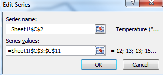
 Legend Entries (Series) allows to enter data series. Click on Add to open a dialog box (see picture to the right) and type in or select both the name for the series and the range of cells corresponding to the series to display in the graph. Make sure that the value ={1} which is present by default in the series values field is fully replaced, otherwise the likelihood to get an error message is high. Click OK to return to the Select data source box.
 To the right of the box, under
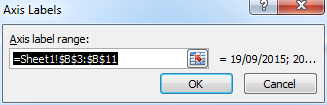
 Horizontal (Category) Axis Labels, click on Edit to open the dialog box Axis Labels (see picture to the right). Select the range of cells corresponding to the dates and click OK.
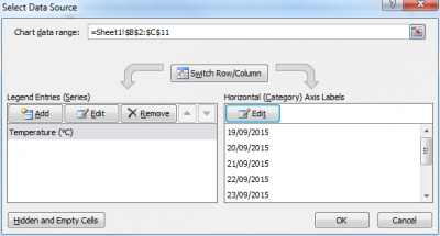 At this point, the
 Select Data Source box should look like this (see picture to the right). Both the data series and the labels for the X-axis are entered. You just have to click on OK to obtain exactly the same chart as with the “easy way”. The difference is that you now know where to add more series if you want to get a more complex chart with multiple series: just go back to the Select Data Source and click Add under Legend Entries (Series) and put a different dataset (such as rain or wind). The X-axis labels remain the same. Click OK to create the chart. You should end up with three line charts of various colors.