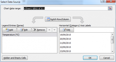
Now that you have managed to make your first line chart, you might want to make things a bit “spicier” by adding an extra line chart to the existing one (Yeah, I know… not really what you consider “spicy”). If you had previously opted for creating your graph using the “easy way”, you will discover here that it is quite simple to add data series to an existing graph. If you had used the “less easy way”, then the following steps won’t be very surprising to you. To add a new series such as “Rain (mm)”, simply right-click in the chart area or the plot area and choose Select Data.... A dialog box shows up.

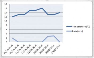
Click on Add under the Legend Entries (Series) and type in the Series name as well as the Series values. Here you may either type them in (be aware that you have to use the right format for the data range…) or select it directly in the worksheet. When done, click OK to come back to the previous window. The new series should now show up in the list of Legend Entries (Series), under the series “Temperature”. Click OK to validate and admire the double line chart to you’ve just created.
 You now end up with a more complex chart that contains two data series, one for temperature and one for precipitation. While the look of the chart may dramatically be improved in terms of aesthetics, there are a couple of things that can be configured differently to give the graph a better “reading”:
