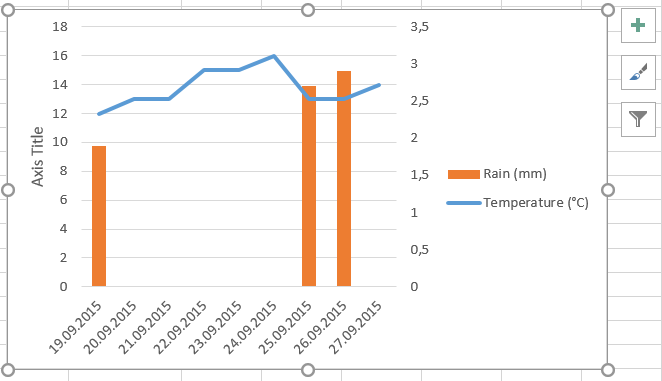
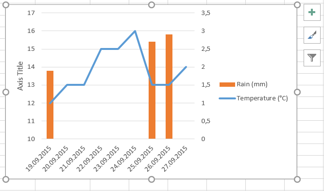
 Let’s now take care of the fact that the temperature line is located quite high in the plot area (top right picture). Most of the values are comprised between 12 and 16, but the chart using a range from 0 to 18 to display the chart. If we want to make better use of the space in the plot area, we just need to rescale the Y-axis so that it displays value on a scale from, for example, 10 to 18.
 To do so, right-click directly on the labels of the Y-axis and select
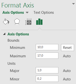
 Format Axis. In the Axis Options, set the Minimum and Maximum to the values of your choice (for example to 10 and 17, respectively).
 Your chart now shows the temperature line in a well-centered and more suited manner.
Fant du det du lette etter? Did you find this helpful?
[Average: 0]
