
Often, the simplest way to visualize your dataset or sample will be through a histogram, also called frequency histogram. The histogram will eventually represent the distribution of the data and the shape of the chart will most certainly give you information on whether this distribution is symetrical, bimodal, skewed…
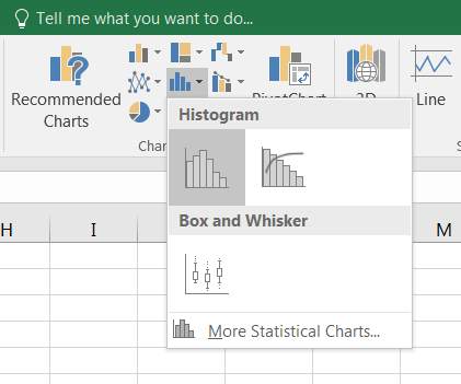 To draw a histogram, select your range of data, then go to the tab
 Insert, find the icon Insert StatisticCharts and choose Histogram.
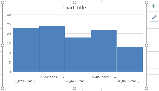 A chart appears and displays 5 bars (by default) representing frequency data. All you have to do now is to decide how many columns you want in your chart, or what will be the size of the ranges or bins which define the columns.
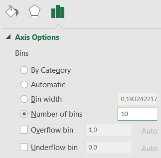 To do so, right-click on the X-axis and select
 Format Axis... Using the menu to the right, indicate the number of bins/bars (for example 10) or the bin width, and press Enter.
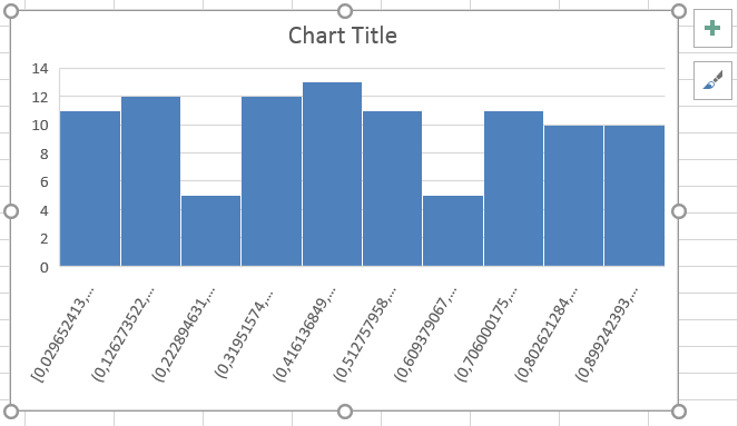 Your chart now displays the distribution of your data according to the 10 ranges that you have defined. Feel free to modify the look of your chart, to add titles, change colors and so on.
Note that the labels under the X-axis are the values which delimits the range of these 10 bars. They do not necessarily match specific values from the dataset, but corresponds to the calculation that Excel makes to find the ranges.
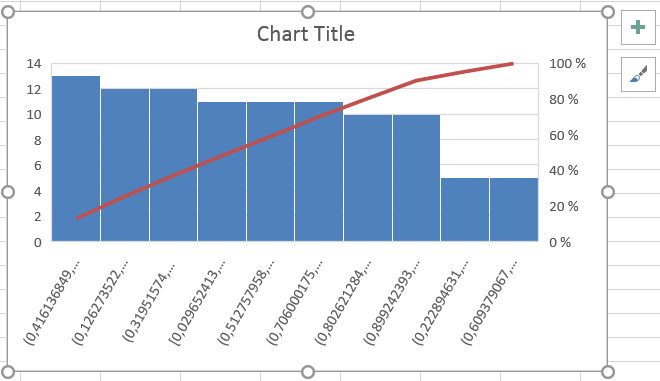 If you choose
 pareto instead of histogram in the dialog box Insert Statistic Chart, you will get a rather similar graph (histogram-like) but where the columns are sorted in descending order from left to right. On top of these columns, a red line displays the cumulative total percentage.