
 It is often useful or required to show the variability of your data when making a chart. This variability can easily be translated by error bars added along your plot line or bars. The bars may represent standard deviation, standard error of the mean, confidence intervals… you choose.
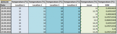
Let’s take a practical example: temperatures were measured at 4 different locations in Bergen. The mean temperature was then calculated as well as the standard error of the mean (SEM).
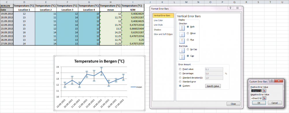
Let’s create the line chart corresponding to the average temperature for each date. Once the chart displayed, click on the data series (line) in the plot area and find the icon Error Bars in the Analysis section of the Chart Tools. Click on the arrow below this icon to display several options. Select More Error Bars Options... to reveal the following menu.
 In the dialog box called
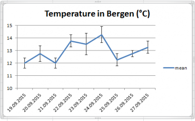
 Format Error Bars, under Display, choose 1) whether you want error bars above the data point, below the data point, or both, and 2) whether the bars will have a cap or not. Then, in Error Amount, choose which value has to be displayed. Since we calculated the SEM in the worksheet, choose Custom and click on Specify Value. The box Custom Error Bars shows up. For both positive and negative error values, select the range of cells in the worksheet that correspond to your data. Note that these values will be automatically paired with the corresponding data points for the given dates. Click OK and Close to validate and obtain the following chart.
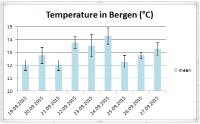 Assuming that you are working with a bar chart, the procedure explained above still applies and give the following result.
Note that the appearance of the error bars is also configurable. In the dialog box Format Error Bars, the section Line Color and Line Style allows you to change colors and thickness, among other parameters.