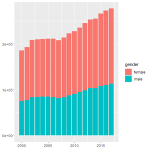
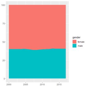
No such thing as "one plot fits all"
Right now, you might be sitting in front of a table with plenty of numbers and variables, with one question: "which plot shall I use for best representing my data?". Since there is no plot or chart type that will work in all situations, you may try to draw various plots and see which one fits best... but this can be time consuming, and might lead you to a sub-optimal chart that will confuse your audience. Rather than that, you should ask yourself a couple of simple questions:
- What is your story or message?
- What do you want to show?
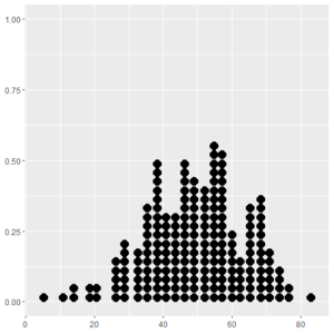
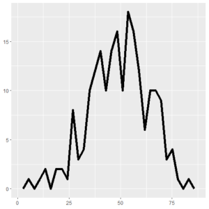
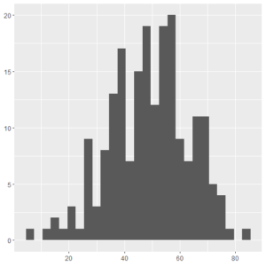
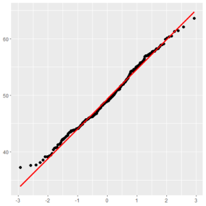
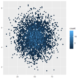
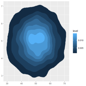
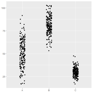
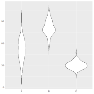
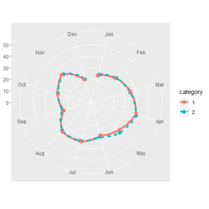
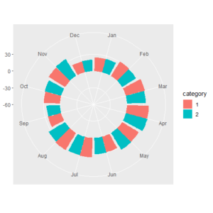
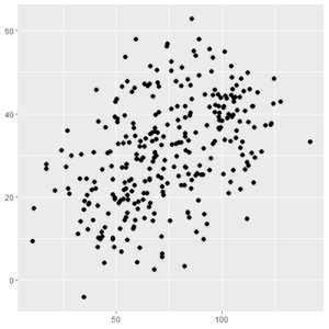
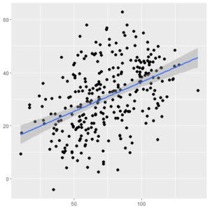
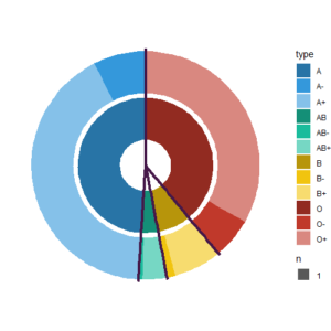
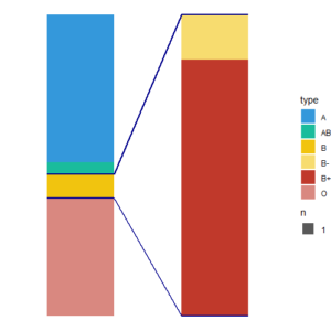
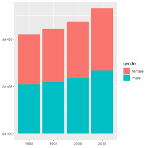
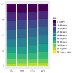
If your answers contain the word "compare", or "distribution", or "relationship", or "percentage/composition", you will be able to narrow down the list of usable plot types. Check then the variables, categories and items in your data set and use the following tool to find a good suggestion. Once you have spotted the plot you would like to draw, click on the title under the picture to access a page that describes how to use ggplot to create that plot (NB: not all the pages are published yet).
I want to represent:
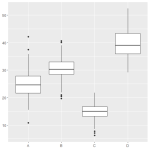
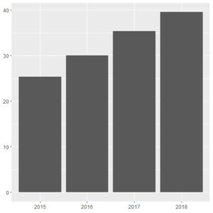
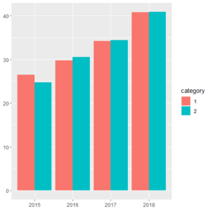
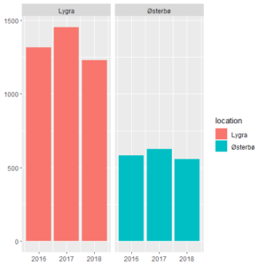
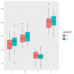
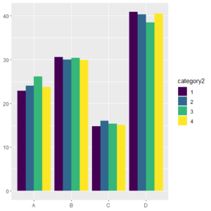
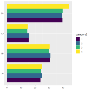
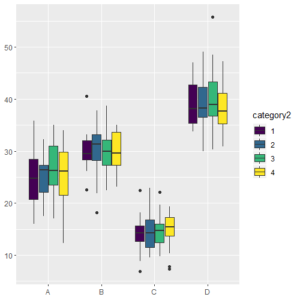
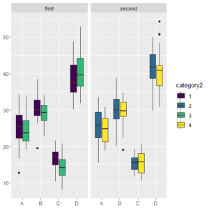
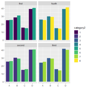
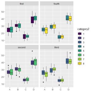
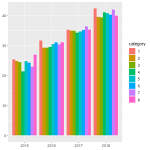
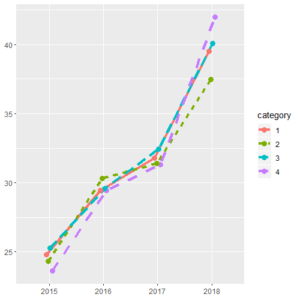
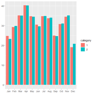
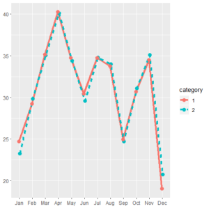
You would like to make a plot that allows for comparison of group statistics (such as mean, median, SD, etc). This is usually done by plotting a selected statistic against the Y-axis, while categories or time are plotted against the X-axis. Bar plots, box plots and line plots are predominant.
Essential elements for a good graph.
Found out which plot(s) fit(s) best your data? Great! But do not forget that a plot is not complete (and thus acceptable) if it does not have elements such as a title, axis titles, units, legend and so on. HERE you will find out how to add the necessary elements and how to do
Limitations of this tool
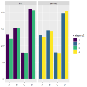
This tool is not meant to provide you with THE answer, but rather give you suggestions on how to represent efficiently your results. If your data set is complex (with categories and sub-categories), you might want to try a multifaceted chart based on classes and sub-categories, or color-coded charts. Again, think about what story you want to tell with your plot, and what the focus is.
Also, some plot types which are rather unused/uncommon in biology (but more often found in the field of economics, for example) have not been included here.
Sources
The content of this page is inspired from:
- Chart Suggestions - A Thought-Starter, www.ExtremePresentation.com - A. Abela
- Data Visualization with ggplot2 Cheat Sheet, RStudio

