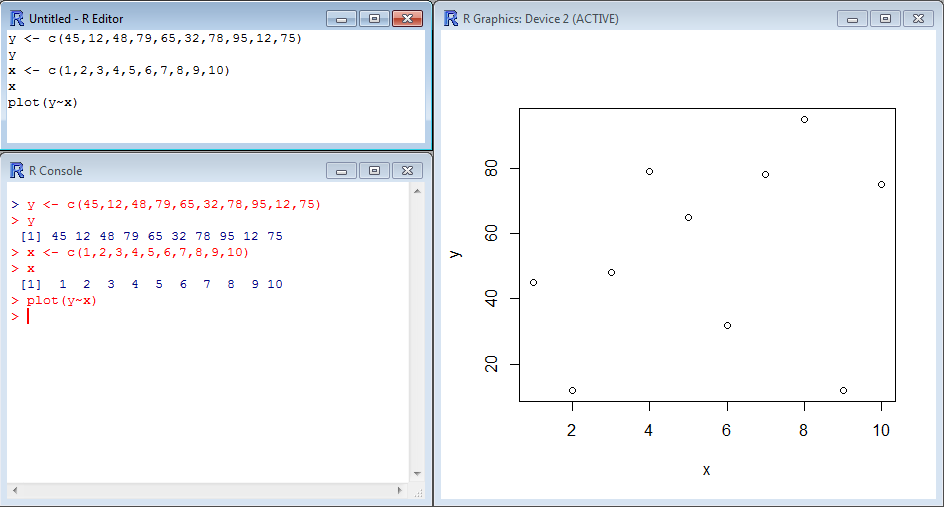
Scatter plots display values in the form of dots, squares, crosses, etc corresponding to 2 variables plotted along the X-axis and the Y-axis. In R, all you need is a pair of vectors, one for each variable, and the function plot().
Here is an example where the dataset consists of 10 values ranging from 12 to 95 which are stored in the vector y while the vector x contains the series 1:10 that will be used as the X-axis. We use the function plot() in the following way plot(Y~X):
[code language=”r”]
y <- c(45,12,48,79,65,32,78,95,12,75)
y
x <- c(1,2,3,4,5,6,7,8,9,10)
x
plot(y~x)
[/code]
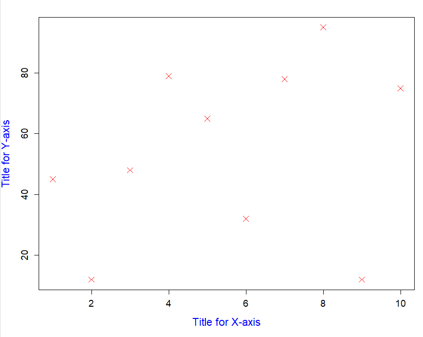
You will find several tools and functions to tune scatter plots in this section. Here is the same example as above, but with titles on the axes, crosses instead of dots, and colors here and there:
[code language=”r”]
y <- c(45,12,48,79,65,32,78,95,12,75)
x <- c(1,2,3,4,5,6,7,8,9,10)
plot(y~x,
xlab="Title for X-axis",
ylab="Title for Y-axis",
cex=1.5,
cex.lab=1.4,
cex.axis=1.2,
col.lab="blue",
pch=4,
col=’red’)
[/code]