
Often, the simplest way to visualize your dataset or sample will be through a histogram, also called frequency histogram. The histogram will eventually represent the distribution of the data and the shape of the chart will most certainly give you information on whether this distribution is symetrical, bimodal, skewed…
This type of chart requires that you bin the range of values of the dataset to create a frequency table. This means that you “create” a decent number of intervals (let’s say 10 or 20 to begin with) and check how many values fall into each of these ranges. In our example, the data range from 0,029652413 (the minimum, see table) to 0,995863502 (maximum, see table). Let’s round it up and say that it ranges from 0 to 1. We know “create” 10 intervals (0-0.1; 0.1-0.2; 0.2-0.3; …; 0.9-1). When done, we draw a histogram (chart with vertical bars) where each bar represents an interval. The height of the bar is defined by the number of values contained in the range.
 To do this in MS Excel, we’ll use again the
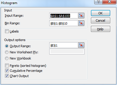
 Data Analysis icon of the Analysis section installed by the Analysis ToolPak (see here). Prior to clicking on the icon, create the list of intervals on your worksheet: enter “0.1” in B1, then “0.2” in B2, … , and finally 1 in B10. Note that the intervals must be placed in ascending order. Now, click on the Data Analysis icon. This time, choose Histogram and click OK. When the Histogram dialog box shows up, fill in the necessary fields.
In Input Range, indicate the range of cells containing the dataset (A1:A100). In Bin Range, indicate the range of cells describing the intervals (B1:B10). In Output Range, choose where you want the table and chart to be located (see here). The last 3 boxes define what will be created by the tool.
 If you choose
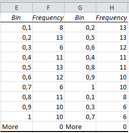
 pareto, you will get a 4-column table indicating the bins (intervals) and the number of data falling into those intervals in the first two columns, while the last two columns contain the same information, but presented in decreasing order of frequency.
 If you choose
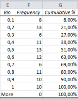
 Cumulative Percentage, you’ll get a table with the same intervals and frequencies, as well as a third column indicating the cumulative percentage.
 If you choose
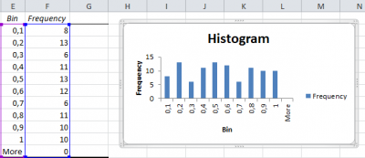
 Chart Output, you finally get the histogram that we were trying to build since a few minutes. Note that the corresponding table of frequencies still shows up next to the chart.
Note that if you choose to tick Chart Output AND one of the two options above, your histogram will be replaced by the chart corresponding to the table that you chose (Pareto or Cumulative Percentage).