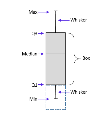
 A boxplot (box plot, or whisker plot) is a compact, but efficient way to represent a dataset using descriptive stats. This “little diagram” combines informative, standard values such as the first and third quartiles (the bottom and top of the box, respectively), the median (the flat line inside the box) and sometimes the mean (a second flat line inside the box). The whiskers are often used to represent the minimum and maximum values, but some use other parameters such as: one standard deviation above and below the mean of the data OR the lowest and highest values contained in the range defined by the 1st quartile minus 1,5 times the interquartile range and the 3rd quartile plus 1,5 times the interquartile range (cf. “Tukey plot”) OR the 5th and 95th percentiles, etc. Anyway, because the whiskers are defined by the user (and not by convention), it is important, when creating the boxplot, to mention what they represent in the legend of the chart.
Unfortunately, such a boxplot cannot be automatically done in MS Excel via a preregistered function, but there is a way to build a chart that will, in fine, look like a boxplot… And for that, you will have to “force a stacked column chart to look like a boxplot“. If you look at the picture to the right, you may realize that the boxplot looks in fact like a stacked column chart (3 boxes on top of each other) where the lower box is made invisible and where the whiskers are nothing else than error bars added under the middle box and on top of upper box. The median is just the border between the two boxes. All you need to do now is to calculate the height of each of the boxes and the whiskers.
 First, you’ll need five values: the first quartile Q1, the third quartile Q3, the median (also known as second quartile Q2), the minimum and maximum (providing that the whiskers will represent the minimum and maximum). Use the functions credits
 =QUARTILE(A1:A100;1), =QUARTILE(A1:100;3), =MEDIAN(A1:A100), =MIN(A1:A100) and =MAX(A1:A100) to get the median, minimum and maximum or activate the Analysis Toolpak to get a table that contains the three values (see here). The first and third quartiles may be calculated using =QUARTILE(A1:A100;Y) (see below).
Note: the function =QUARTILE(X;Y) calculates the quartiles of a dataset. In the function, replace X by the range of cells containing the data (in our case, A1:A100) and Y by:
– 0 to obtain the minimum of the dataset (Q0),
– 1 to get the first quartile (Q1),
– 2 to get the second quartile (Q2)
– 3 to get the third quartile (Q3),
– 4 to get the maximum of the dataset (Q4).
You may realize that our five values which are necessary for making the boxplot may be obtained simply by using 5 times “=QUARTILE(A1:A100;Y)”. All you need to do is to replace Y by 0, 1, 2, 3 and 4 to get Q0, Q1, Q2, Q3 and Q4, respectively.
Now we need to perform a series of simple calculations in order to draw the boxes later on:
– in the cell C1, calculate Q1 by typing =QUARTILE(A1:A100;1) (size of the lower box in the stacked column),
– in the cell C2, calculate Q2-Q1 by typing =QUARTILE(A1:A100;2)-QUARTILE(A1:A100;1) (size of the middle box in the stacked column),
– in the cell C3, calculate Q3-Q2 by typing =QUARTILE(A1:A100;3)-QUARTILE(A1:A100;2) (size of the upper box in the stacked column).
Then gather the necessary values to draw the whiskers:
– in the cell C4, calculate Q4-Q3 by typing =QUARTILE(A1:A100;4)-QUARTILE(A1:A100;3) (size of the upper whisker),
– in the cell C5, calculate Q1-Q0 by typing =QUARTILE(A1:A100;1)-QUARTILE(A1:A100;0) (size of the lower whisker).
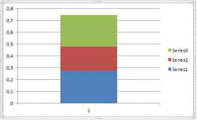 Now it is finally time to draw the boxplot. First, click on the
 Column icon located in the Charts section of the ribbon under the Insert tab and choose Stacked Column. Then, right-click anywhere in the empty chart area and choose Select Data. To the left, click on Add and place in Series Values the cell C1; click OK to validate. Click again on Add and place in Series Values the cell C2; click OK to validate. Click on Add a third time and place in Series Values the cell C3; click OK to validate. At this point you should have a chart that looks like this (see picture to the right) with three boxes on top of each other.
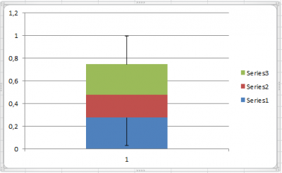 The next step consists in adding whiskers to the boxes, and if possible at the right place… Select the lower box of the chart, go to the
 Chart tools menu on top of the screen, choose Layout, select the Error Bars icon and click on More Error Bars Options.... In the section Error Amount, select Custom and click on Specify Value. In both fields, refer to the cell C5 and validate with OK. In the section Display, choose Minus and Cap. Click Close. Back to the chart, select the upper box, go to the Chart tools menu on top of the screen, choose Layout, select the Error Bars icon and click on More Error Bars Options.... In the section Error Amount, select Custom and click on Specify Value. In both fields, refer to the cell C4 and validate with OK. In the section Display, choose Plus and Cap. Click Close. The whiskers are now in place (see picture to the right).
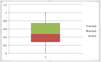 Last step: get rid of the lower box! Right-click on the lower box of the chart and select
 Format Data Series.... In the Format Data Series dialog box, choose Fill in the left panel. In the corresponding right panel, select No fill and click on Close. The lower box is now invisible (the object is still there and you may still select it… but it is now transparent).
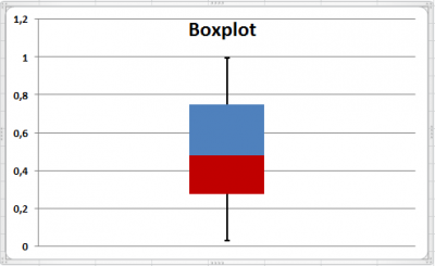 Feel free now to change the settings of the chart at your will. Change the thickness of the boxes and whiskers to make it a bit more visible; make the column/boxes narrower; use a different set of colors to avoid getting in trouble with color blind teachers and reviewers; add labels and titles wherever needed. Most of the tools to do this are found in the
 Chart Tools, under the tabs Design, Layout and Format when the chart or the elements of the chart is/are active.
