
Bar graphs (also called bar charts or column charts) are useful to rapidly visualize differences between groups or categories. The relative height of rectangular bars or boxes makes it easy to spot these differences, even when many categories are represented on the same chart.
Creating bar graphs does not require much time or code per se. Here is a quick way to draw such a chart based on an example from the lab course in microbiology in BIO101 – Organisme Biology I. In this example, the number of bacterial colonies growing on petri dishes from samples taken in various locations of our buildings were counted. We draw the corresponding chart in R using the function barplot().
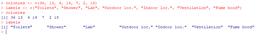
Here is the dataset. It consists of a vector called “colonies” containing all the values to display and a vector called “labels” with the names of the locations. Note that unlike other plotting functions, barplot() does not accept dataframes, but prefers vectors and
[code language=”r”]
colonies <- c(36, 13, 4, 14, 7, 2, 18)
labels <- c("Toilets", "Shower", "Lab", "Outdoor loc.", "Indoor loc.", "Ventilation", "Fume hood")
colonies
labels
[/code]
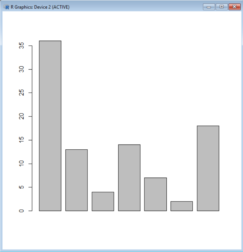
To create the chart, use barplot() in which you use the vector with the data as first argument:
[code language=”r”]
barplot(colonies)
[/code]
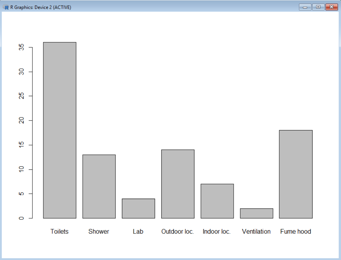
You may then add labels under the bars based on the contain of the vector labels using the argument names.arg
[code language=”r”]
barplot(colonies, names.arg = labels)
[/code]
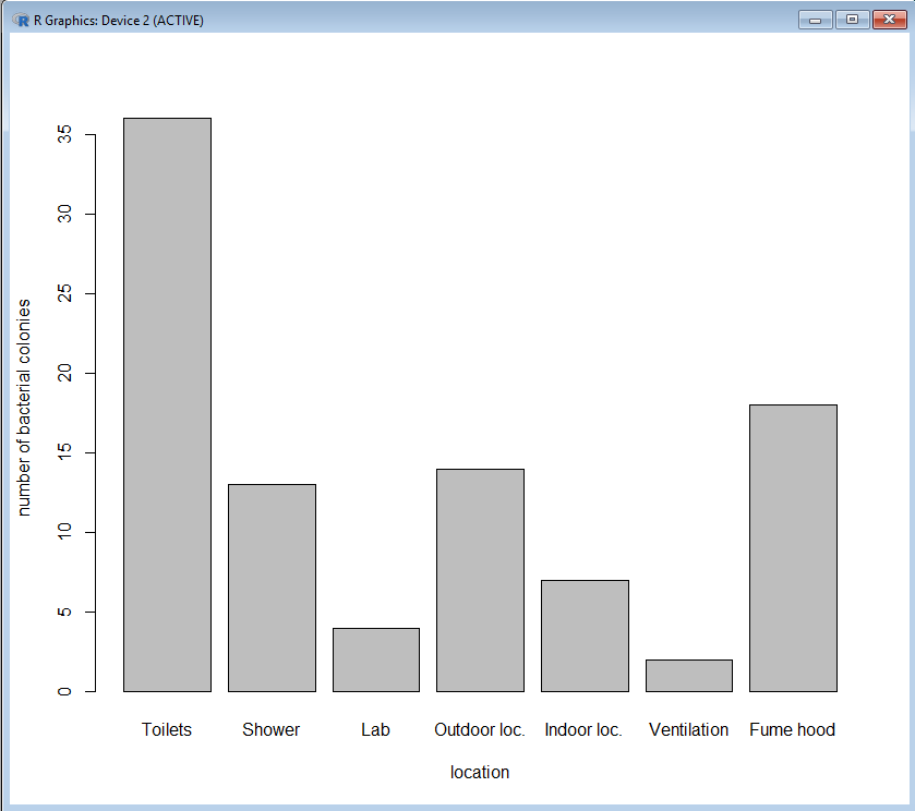
Use xlab and ylab to add titles to the axes:
[code language=”r”]
barplot(colonies, names.arg = labels, xlab="location", ylab="number of bacterial colonies")
[/code]
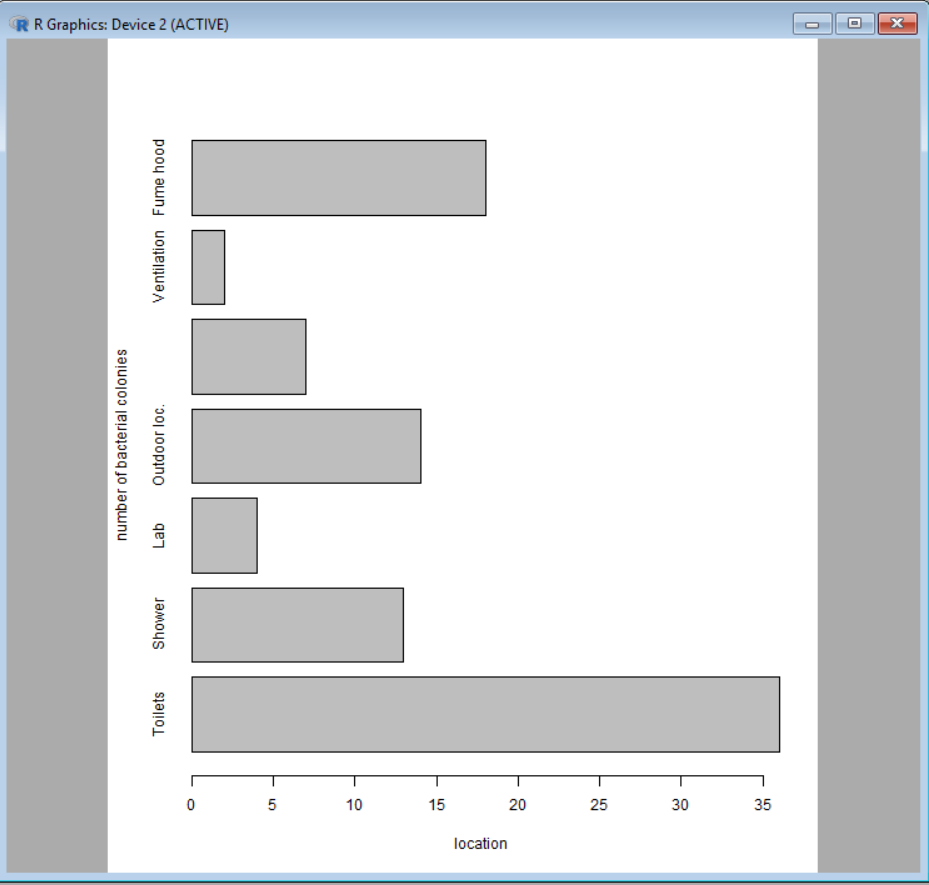
Note that it is possible to create a horizontal bar graph simply by adding horiz = TRUE in the function:
[code language=”r”]
barplot(colonies, names.arg = labels, xlab="location", ylab="number of bacterial colonies", horiz = TRUE )
[/code]
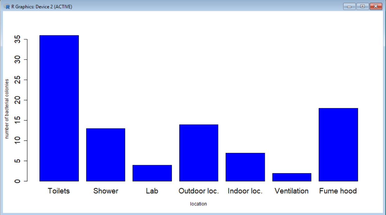
And of course it is possible to change colors, font size, etc.
[code language=”r”]
barplot(colonies, names.arg = labels, xlab="location", ylab="number of bacterial colonies", col="blue", cex.names = 1.5, cex.axis = 1.5 )
[/code]
Check HERE for more info about barplot().