
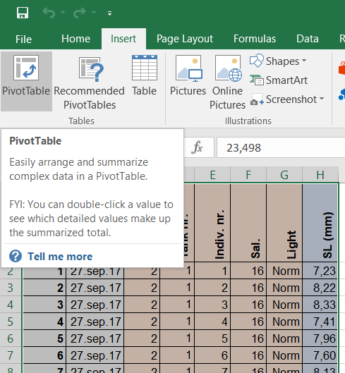
 To create a pivot table from the dataset introduced previously here (and downloadable here), select the table (A1-H721), choose
 Insert in the main menu, and Pivot Table.
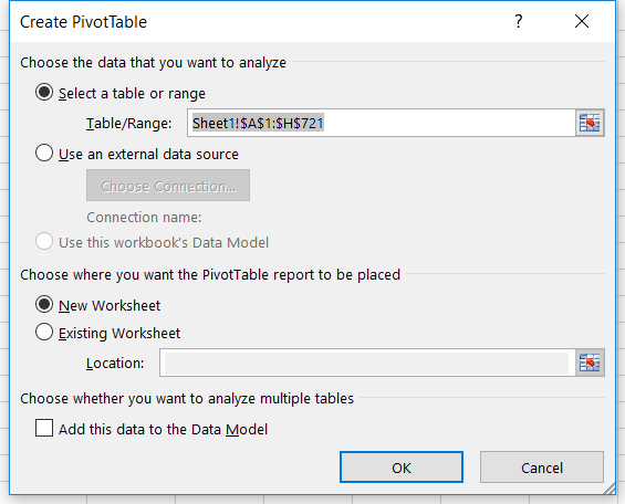 In the dialog box that shows up, you may choose the data (if it is not already done) and whether you want the pivot table to appear on a new worksheet or in the same one as the original table. If you choose to have it next to the original table, simply indicate which cell its top left corner will be located at.
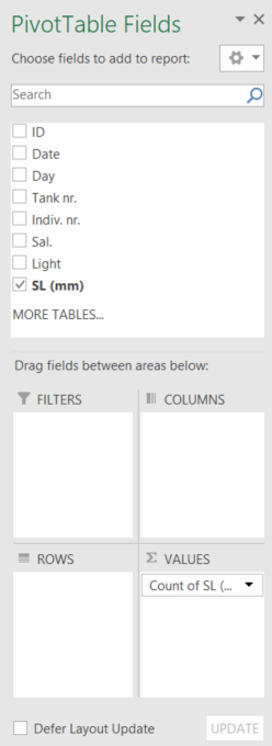 The new menu
 PivotTable Fields that appears to the right of your screen will help you organize the pivot table. With the menu, you will be able to choose which values to display (counts, averages, minimum or maximum values, standard deviations, etc) and whether you want to do so for each category (or a selection of categories) named in the table (for instance per light condition, salinity condition, tank, date, etc).
First, select a dependent variable to display in the pivot table, here the standard length (SL (mm)) . To do so, click and hold SL (mm), then drag it in the box Σ VALUES in the lower right corner of the side menu.
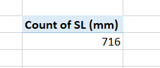 In the worksheet, a pivot table made of 2 cells has appeared, showing
 Count of SL (mm) and 716. This count tells you how many cells in the SL (mm) column contain numerical data (it is indeed a count of entries). Note that from now on, the changes you will perform in the right side menu will show up “live” in the newly created pivot table.
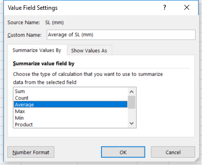 If you wish to get averages (or any other statistic) instead of counts, go back to the side menu and click on
 Count of SL (mm) in the box Σ VALUES. Choose Value Field Settings... and select Average in the menu, then OK.
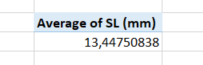 The pivot table now shows
 Average of SL (mm) and its value based on all the data in the whole table.
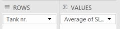 Now, you may decide which category (or categories) you want to see the average of. Let’s assume that you are interested in getting the average of standard length for each tank. We go back to the side menu and drag and drop
 Tank nr. from the list of available fields down to the box called ROWS.
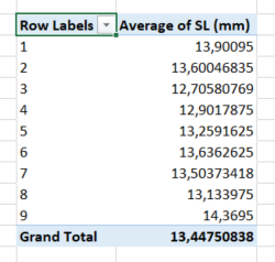 The pivot table now looks like this. The 9 tanks are displayed in rows with their labels (1-9) in the left column and the corresponding average in the right column, and the average of the whole table comes at the bottom as a “grand total” (and you can see that this grand total matches the average that was displayed in the pivot table just before we divided the table in rows).
We could have similarly dispatched the tanks horizontally by dragging and dropping Tank nr. from the list of available fields down to the box called COLUMNS.

These are the basics on how to create a simple pivot table. From there, things can get quite interesting/complicated, depending on whether you want to:
- display several statistics at the same time (e.g. average and standard deviation),
- display only a subset of values in a specific category (e.g. only the data from tank 1, 3 and 8),
- display statistics for a combination of parameters (e.g. light and salinity),
- …
The following posts will show you how to go further with pivot table.