R -8- Plot types

R is definitely a powerful tool when it comes to making plots and charts. Here we will quickly review some of the most common charts that you can create in R via a series of examples. It is not the purpose of this page to show you how to do everything and anything in terms of chart making; we rather focus on getting you started with different types of charts.


hist2
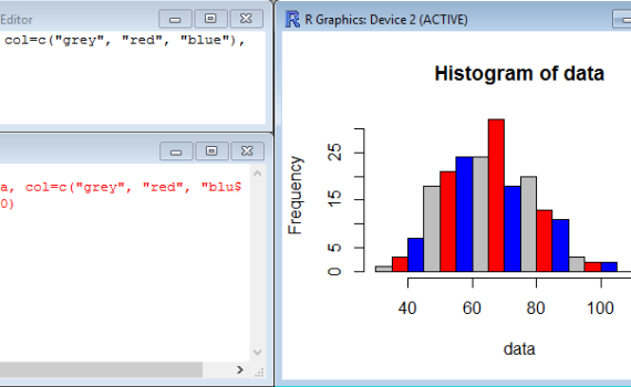
The function hist() is a very simple function which does not require much to build a histogram of frequency (representing the distribution of data series) based on the content of a vector.  Simply typing hist(z), for example, creates a histogram of the vector z made of 10 bars (by default). […]

1. Histogram (of frequency)


pie
You may use pie charts to visualize the proportions of various groups relative to each other and to a whole population. The function that creates pie chart is called pie(x,y) and mainly need two arguments: x which is a numerical vector which contains the size/proportion of the slices, and y […]

2. Pie charts


We have seen in a different section that boxplots are useful charts which represent several features of a dataset: median, quartiles, minimum and maximum, possible outliers… These boxplots become even more useful when they are placed side-by-side in the same chart, and represent different groups to compare. For instance, when […]

3. Multiple Boxplots


Bar graphs (also called bar charts or column charts) are useful to rapidly visualize differences between groups or categories. The relative height of rectangular bars or boxes makes it easy to spot these differences, even when many categories are represented on the same chart. Creating bar graphs does not require […]

4. Bar graphs


Scatter plots display values in the form of dots, squares, crosses, etc corresponding to 2 variables plotted along the X-axis and the Y-axis. In R, all you need is a pair of vectors, one for each variable, and the function plot(). Here is an example where the dataset consists of […]

5. Scatter plots


In R base graphics, there is no function that will directly draw a line chart on its own. Instead, you will need to start with a regular scatter plot with your data represented as dots for example, and then join the dots with lines. While the scatter plot will be […]

6. Line plots