
jonathans
La oss være ærlige, "et bilde er verdt tusen ord", men en vitenskapelig figur er ikke verdt mye uten sin forklarende figurtekst! Du kan bruke mye tid på å lage en fin illustrasjon eller tegning, lagt til farger og piler, etc, men i utgangspunktet er sjansen stor for at meningen […]
Hvordan skrive figurtekst
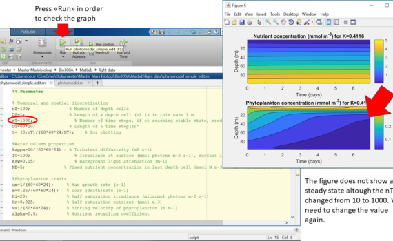
Authors: William Aure Aannø, Cathrine Onarheim, Hege Skaar & Ingunn Stautland Phytoplankton need light for photosynthesis, and many animals are dependent on light for vision. Biologists therefore study light in the fjords to obtain knowledge about the conditions for primary production and the vertical structure of the biological community. Light […]
Light measurements and modelling of phytoplankton distribution
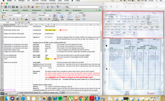
Authors: Celina Eriksson Bjånes, Lea Marie Hellenbrecht, Frida Reinsfelt Klubb & Ine Moksness. On this page, you will be guided through a step-by-step manual of how one collects biological data from a trawl-catch and transferred to digital data ready for analysis. 1. Trawl catch 2. Handling the catch in the […]
From raw data to meaningful analysis – Fisheries Data Collection
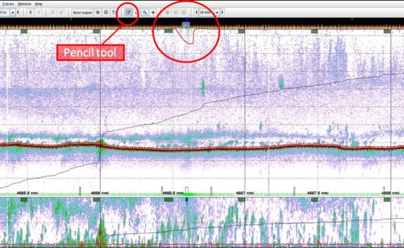
Authors: Erling Boge, Erlend Mjelde Hanssen, Håvard Kaland, Jenny Neuhaus & Leah Strople. Acoustic surveys have several important roles in stock assessment, giving estimates on local abundance and concentration of fish and plankton species in the water column (Koslow, 2009). Given the depth and decibel (dB) values for certain species, […]
A technical guide to analyzing acoustics data
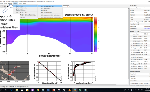
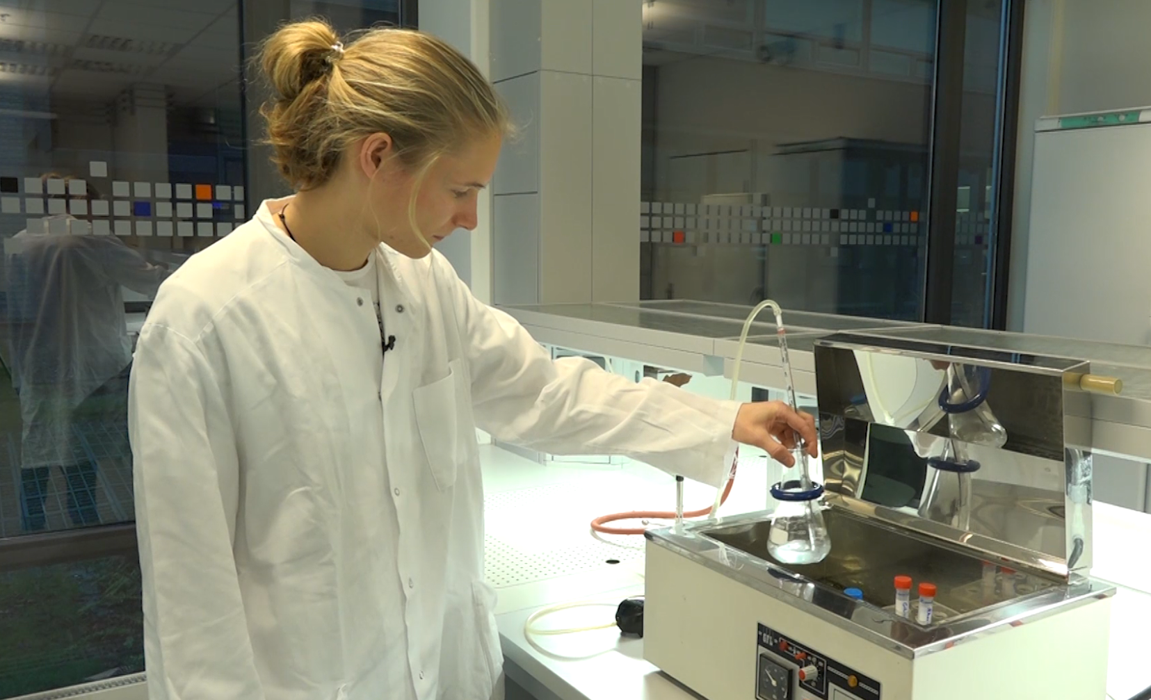
Authors: Thea Båtevik, Magnus André Hulbak, Patricia Koch, Øyvind Langenes, Cecilie Gotaas Sørensen. CTD (conductivity, temperature and depth) is an ocean research tool that is used during research cruises to measure the physical properties in the water. Watch this video to learn more about CTD sampling.
CTD-data: how to use and present
What is the difference between brightfield, darkfield and phase contrast?
Mikroskopering – innføring
How can you test antibiotic resistance in bacteria?
Mikrobiologi – Antibiotika resistans
Working with small datasets or tables, it is usually easy to spot a mistake, a typo, a value that is much larger than the rest (potential outlier?), a cell format which is wrong or the result of a formula that is invalid. Here are two obvious examples of mistakes that can […]
1. What is quality check and why is it useful?
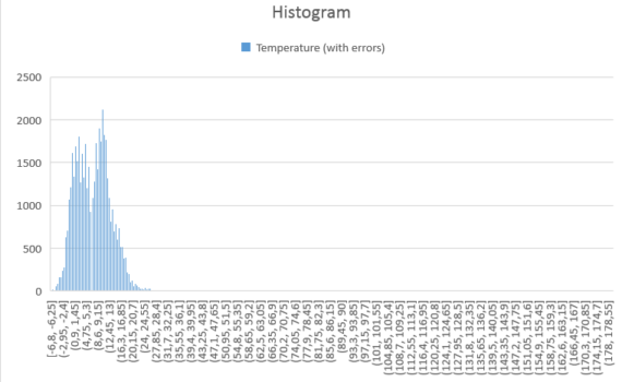
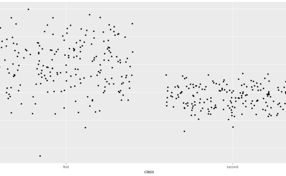
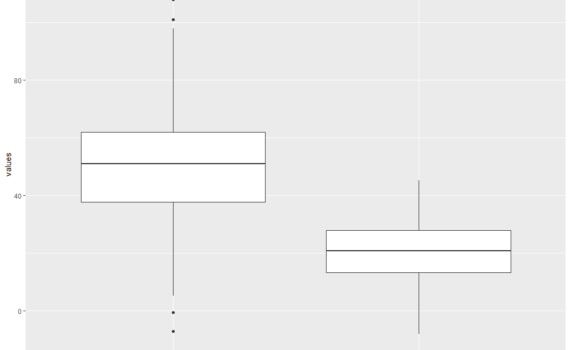
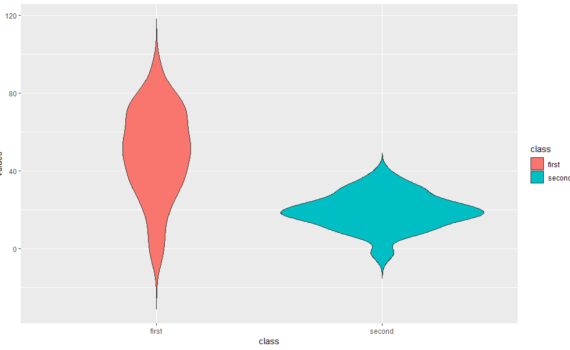
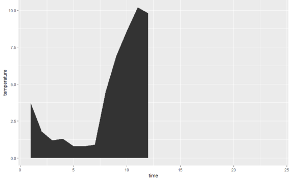
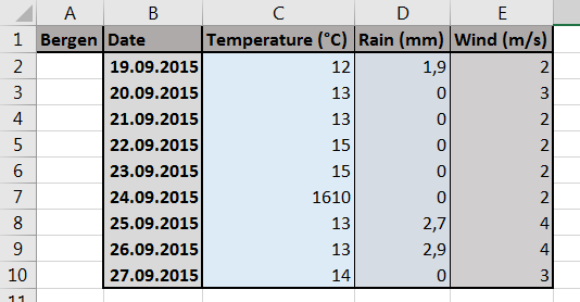
It is often recommended to start looking at a dataset with a plot, prior to any statistical analysis. A plot can reveal a lot: trend, variability, clusters, subpopulations, distribution. It can also reveal mistakes in the dataset, such as aberrant values. Here is an example where local temperatures have been […]
2. Spotting aberrant data with plots
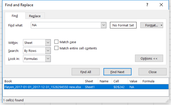
If you wish to check that your dataset has been entered properly in Excel, you may use a couple of tools like Sort & Filter and Conditional Formatting. Here is an example where local temperatures have been retrieved from a weather station at Fløyen, in Bergen for the period 1/1/2017-31/12/2017 and […]
3. Spotting aberrant data using “Sort & Filter” or “Conditional Formatting”
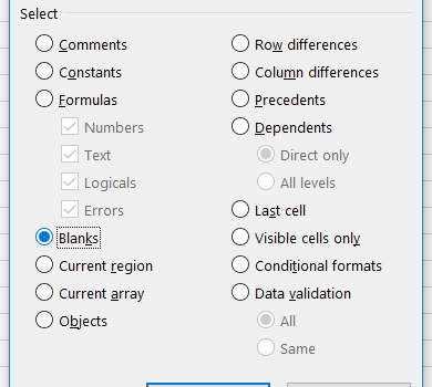
Providing that your data set is well organized, with categories/variables placed in columns and observations in rows, you may be able to spot aberrant data points by creating a pivot table. What pivot tables are and what they may be useful for is discussed further here. A pivot table can […]
4. Spotting aberrant data with pivot tables
A pivot table is a table that displays statistics generated from a larger table that contains your “raw” data set. This pivot table may display counts, sums, averages and other statistics describing variability. It thus allows you to get an overview over thousands of data points within a few clicks. […]
1. What is a pivot table
Everything starts with a clean dataset! A clean dataset means that: the independent and dependent variables are organised in columns, each column has a unique title (header), each row has only one entry per variable, empty cells in the table should be avoided. Let’s take an example. We conduct an […]
2. Preparing the table for a pivot table
To create a pivot table from the dataset introduced previously here (and downloadable here), select the table (A1-H721), choose Insert in the main menu, and Pivot Table. In the dialog box that shows up, you may choose the data (if it is […]
3. Creating the pivot table
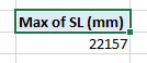
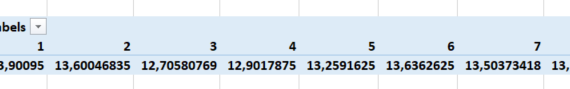
In this post, we keep using the example introduced here. We had built a pivot table showing the standard length SL (mm) for each of the 9 tanks. The side menu looked like this. And the pivot table looked like this. […]
4. Displaying several statistics in a pivot table
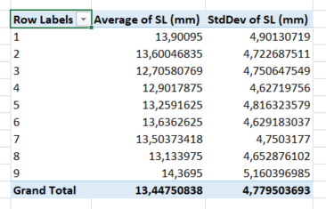
In this post, we keep using the example introduced here. We had built a pivot table showing the standard length SL (mm) for each of the 9 tanks. The side menu looked like this… …and the pivot table looked like this. In […]
5. Displaying a subset of a category in a pivot table
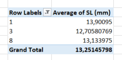
In this post, we keep using the example introduced here. We had built a pivot table showing the standard length SL (mm) for each of the 9 tanks. The side menu looked like this… …and the pivot table looked like this. In […]
6. Displaying statistics for a combination of parameters
Presenteres av: Marius Rydningen Saltvedt Diauxi er en mekanisme for regulering av enzymsyntese som kalles katabolitt represjon. Det viser seg at syntesen av forskjellige (uavhengige) katabolske enzymer er hemmet når en mikroorganisme utnytter (vokser på) en bestemt energikilde, som f.eks. glukose. Dersom vekstmediet i tillegg til glukose også […]
Mikrobiologi – Diauxi Forsøk
Authors: Renate Marie Alling, Guillaume Etienne Mercier, Bryony Sherlock & Vassily Sebastian Zavoico
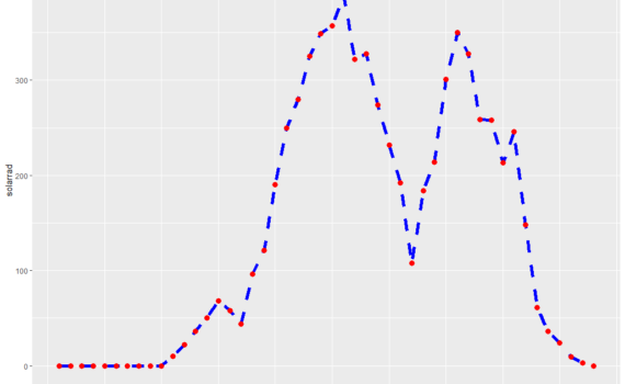
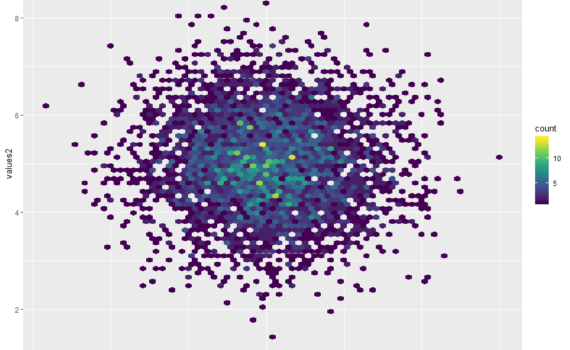
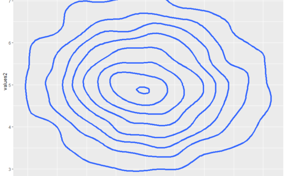
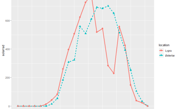
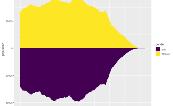
How to find population peaks in R – a visual representation.

Authors: Charlotte Faraas, Lena Götz & Marie Aas Westvik
How to use the which.max function in R to find the peak abundance?

Authors: Angeline Bruls, Nanna Devantier, Linn Marie Flølo & Julian Robin